Brutalink Display is a modular display typeface built from a strict system of weight, spacing, and subtraction. Inspired by brutalist architecture and system graphics, its stencil-like forms prioritize visual impact over legibility.
Initial PROSCESS
My initial idea for Brutalink was to give myself a design challenge defined by rigid rules; I wanted to create an alphabet where each letter exists within the same grid and feels unified. This ended up being quite the undertaking, as it was my first time designing an entire typeface from scratch. I won't say the rules here, but there were multiple iterations of each letter in an attempt to keep things unified.
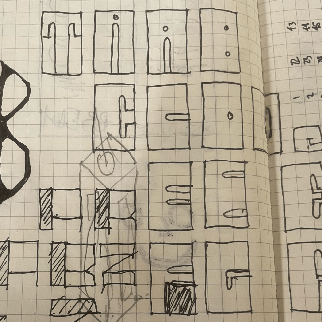
Initial idea sketches + Some other random stuff in my sketchbook
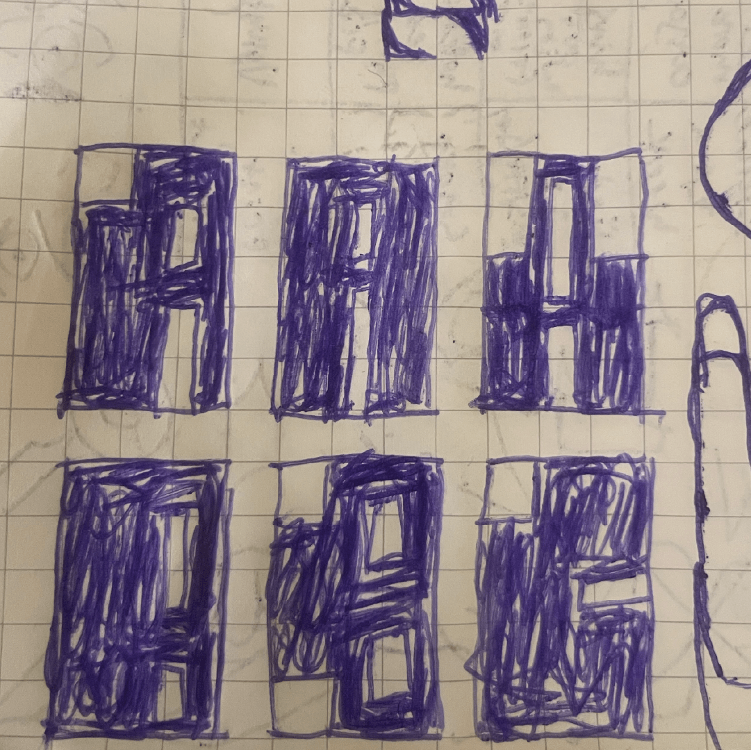
More sketches (trying to lock in the blocky style)
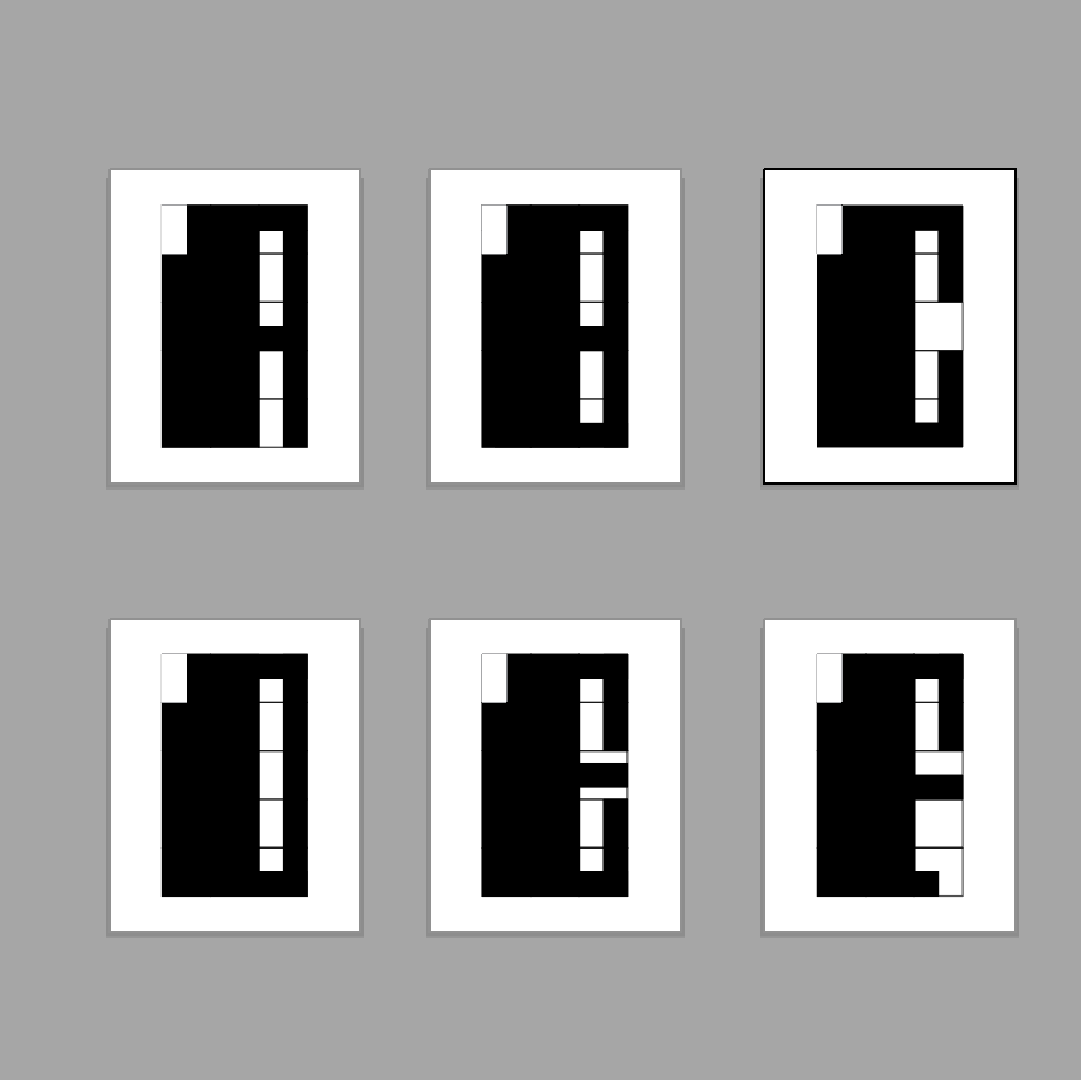
First set of digitized letter forms
Full digitization
After sketching and then digitizing my initial thoughts, I began to really define the constraints of the system I was working in, and over the period of a few days, I was left with an almost complete set of letters; some were quite tricky to figure out, such as J, V, Y, and Z. Below is my first set of digitized letters still within their grids.
FINALIZED TYPEFACE
I made a few adjustments to the typeface before calling it complete, such as rounding some of the edges, but after following my rigid system and working through the challenging letters, there was not much else to do.
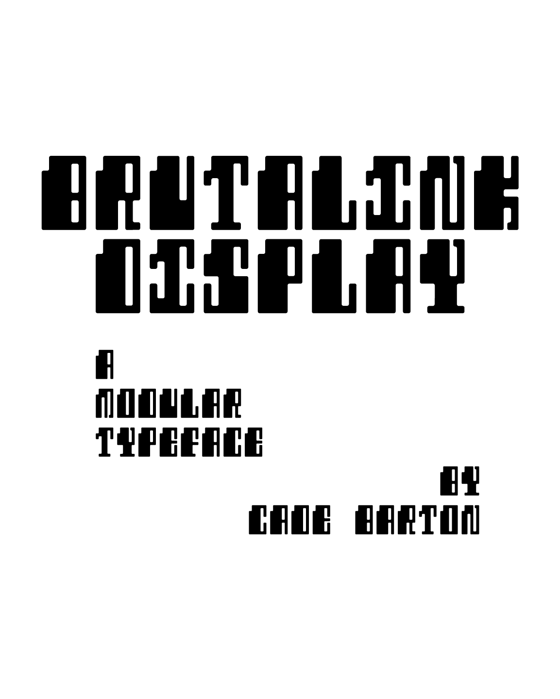
Title Card
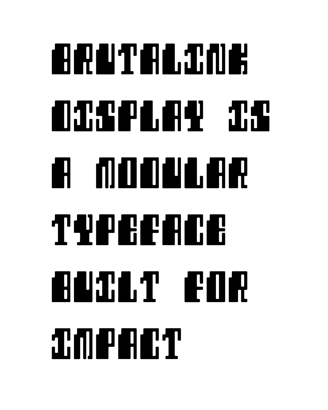
Description/Letters In Action
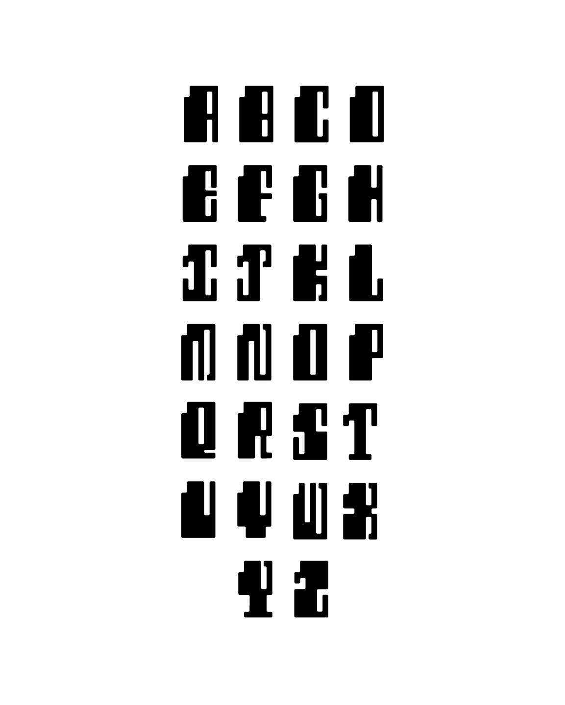
Full Typeface
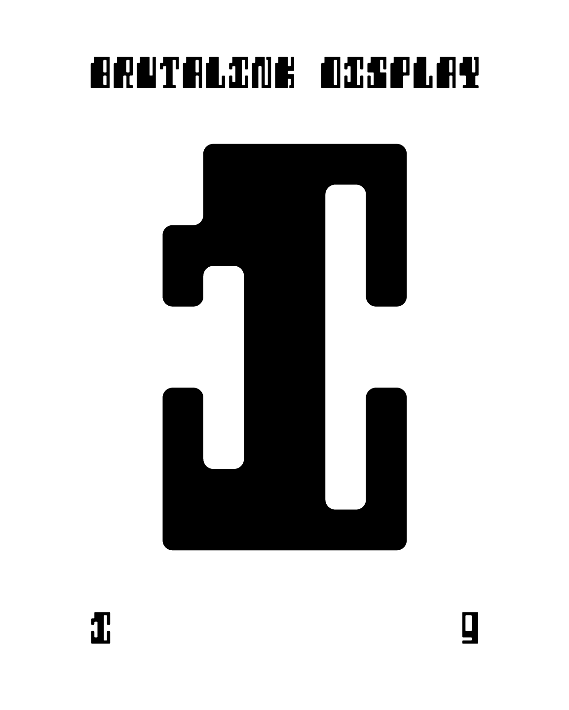
Letter Sample #1
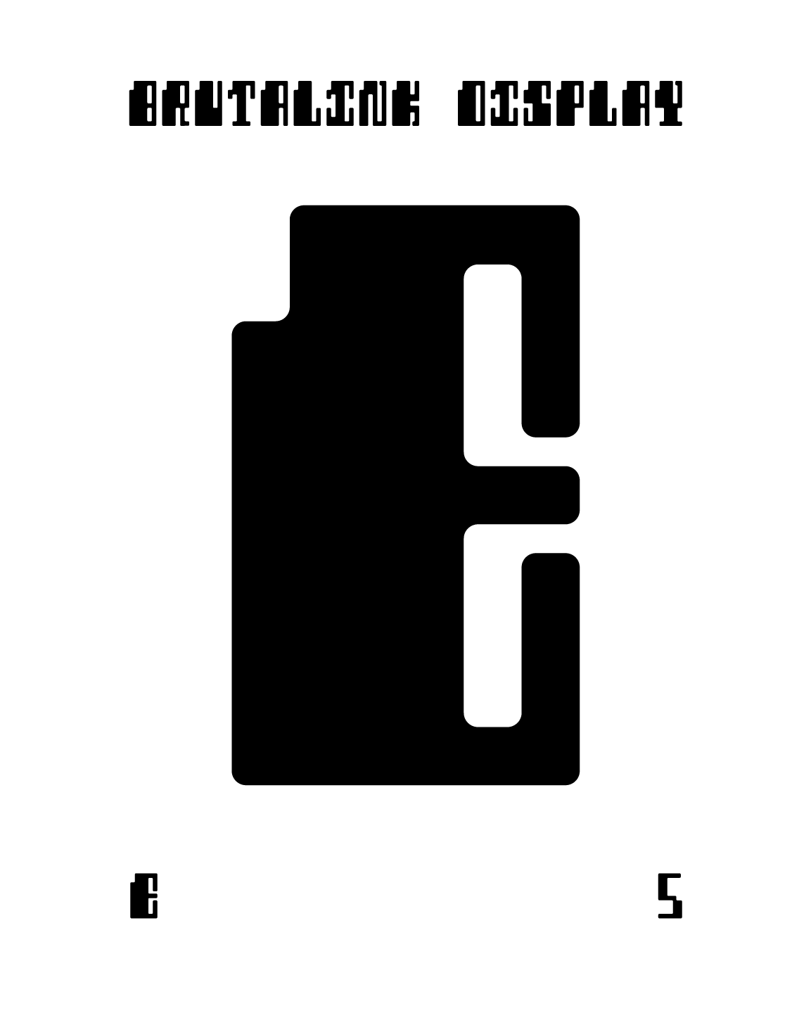
Letter Sample #2
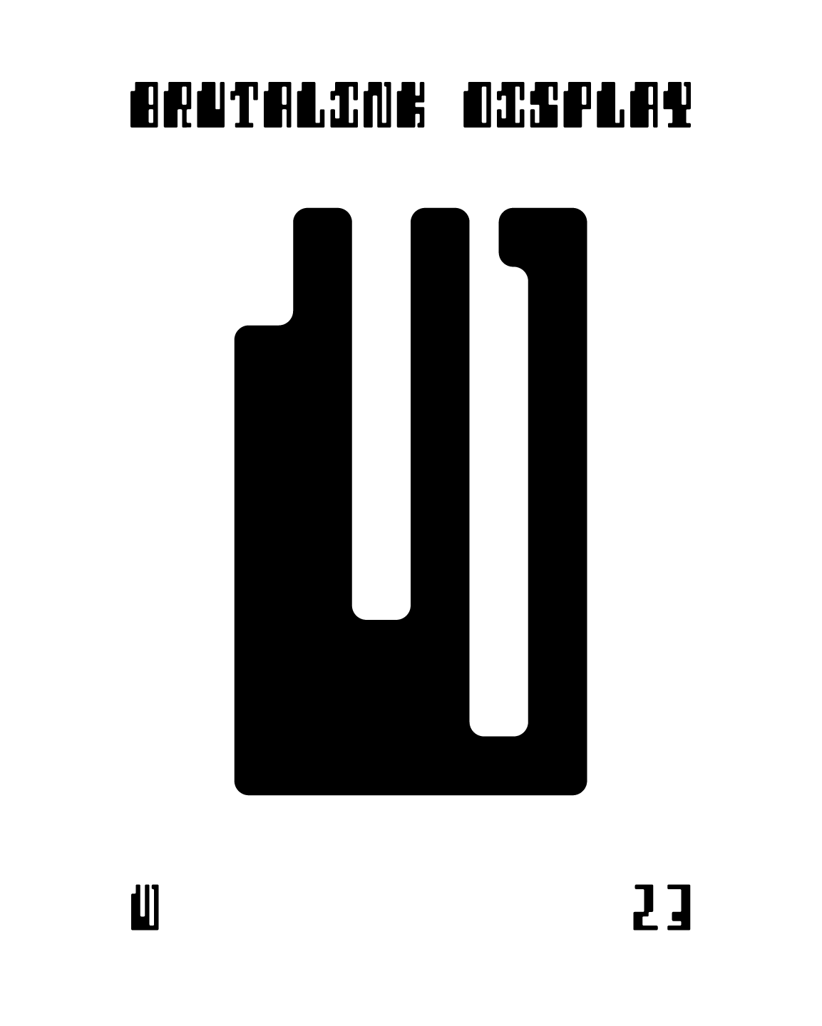
Letter Sample #3
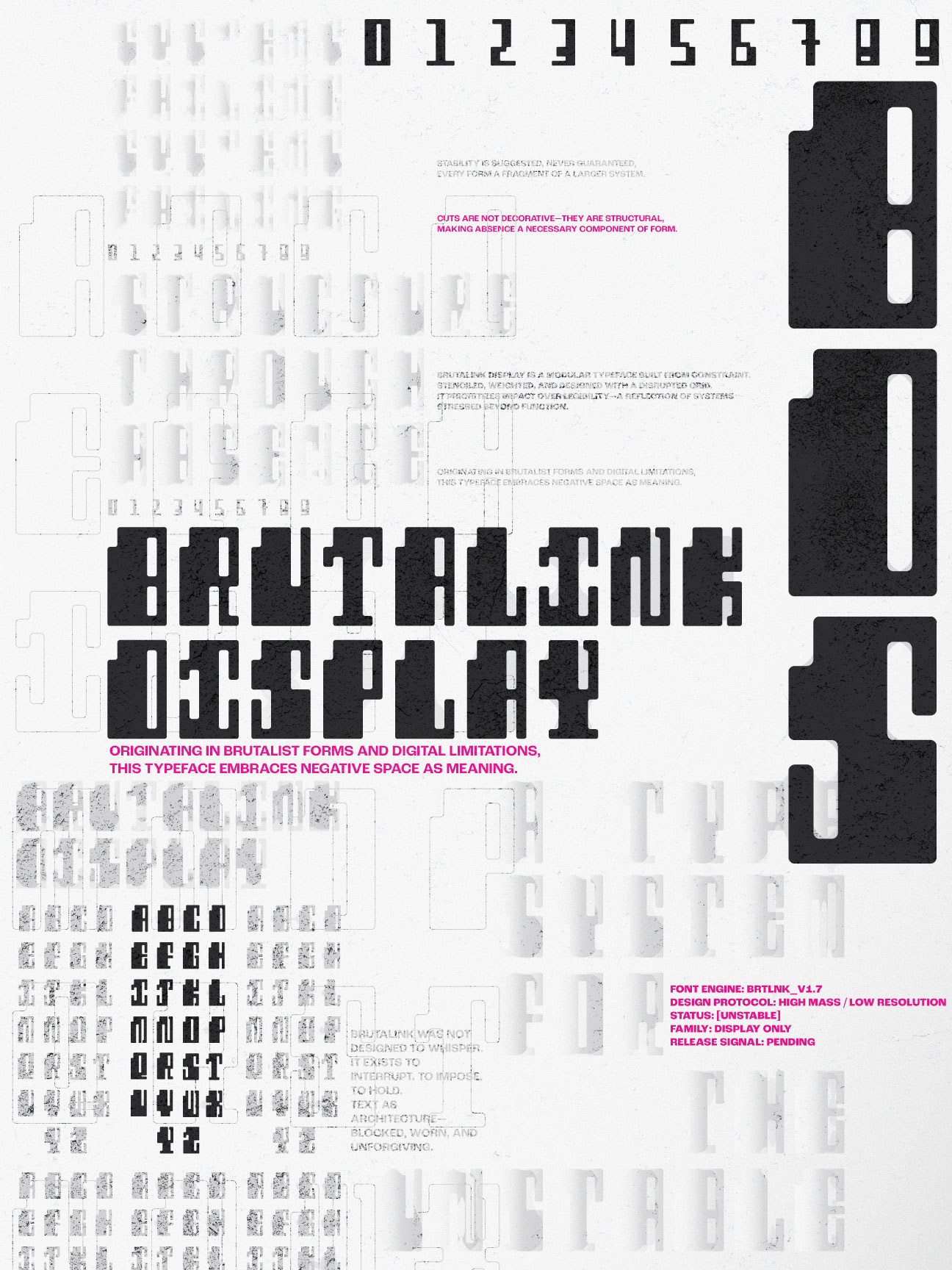
BRUTALINK POSTER
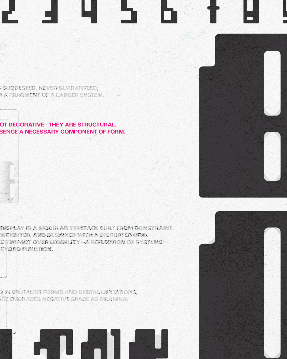
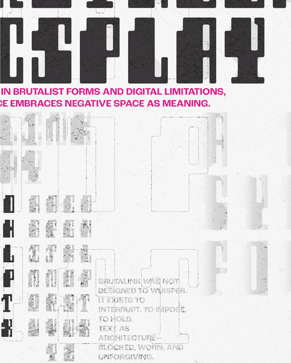
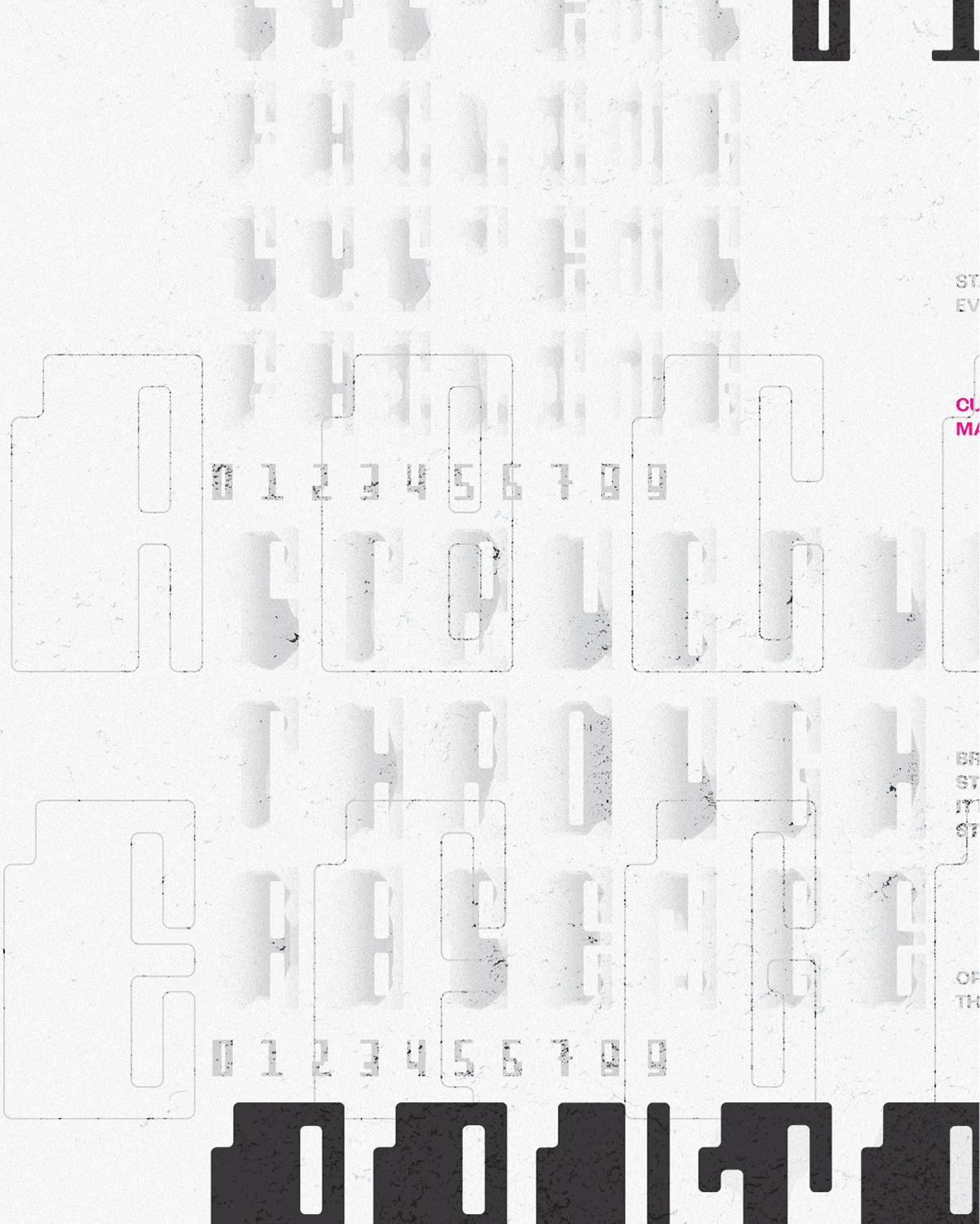
As a conclusion to this project, I designed a poster to show the typeface in use and in full effect. The poster is meant to highlight the typeface's qualities and origin.